Welcome to the LoopOS Brand Hub
Everything you need to represent LoopOS consistently — voice, logo, colour, type, and imagery.
Introduction
One brand, one system
LoopOS is a master brand + sub-brand system. Every brand shares a single geometric loop mark; sub-brands recombine that geometry and swap the gradient stops.
Master + sub-brands
LoopOS is the master brand. Core, Submission, Validation, Hubs, Handling, Impact and Flux extend the same loop geometry.
Contact
Questions about brand usage? Reach the team before adapting the identity for a new context.
Our brand
Vision & purpose
Vision
Unlocking value and driving global transformation through scalable, practical, and accessible circular channels — creating lasting impact for society and the environment.
Purpose
Empowering businesses to adopt the Circular Economy by overcoming technological barriers and enabling sustainable practices for the benefit of society and the environment.
Our brand
Values
Trustworthy
We uphold ethical practices and transparency, ensuring trust in the lasting impact we create for businesses, society, and the environment.
Innovative
We drive progress by delivering innovative solutions to the complex challenges of circular ecosystems.
Fast-to-market
We move quickly, shipping real value without sacrificing craft or reliability.
Collaborative
We unite brands, service providers, and logistics partners to create thriving circular ecosystems.
Approachable
We make Circular Economy solutions simple, accessible, and inclusive for businesses of all sizes.
Agnostic
Our platform integrates with any sector, market, or use case — making circularity achievable everywhere.
Our brand
Tone of voice
How LoopOS sounds across every surface.
Approachable
Communicate complex ideas in a straightforward way, avoiding jargon.
Confident
Speak with conviction to showcase expertise.
Friendly
Balance professionalism; avoid being overly casual or overly formal.
Open-minded
Language reflects inclusivity and accessibility.
Inspirational
Inspire action by highlighting positive impact.
Authentic
Maintain a consistent tone across all content.
In writing
Always written “LoopOS” — uppercase L and uppercase OS, never Loopos / loopOS / LOOPOS. The wordmark is never used inside running text. Taglines are sentence case. Headlines fit on one line; bullets stay under nine words. No exclamation marks. No italics for emphasis.
Identity
Our logo
The loop mark + wordmark. Keep clear space equal to the symbol height; never stretch, skew, rotate, recolour, or add effects.
Clear space
Keep padding equal to the height of the symbol on all sides.
Minimum size
Symbol ≥ 24 px; wordmark ≥ 64 px wide. Below that, legibility breaks.
Incorrect usage
No stretch, skew, rotation, stroke, shadow, or gradient swap. Use the negative assets for single-colour needs.
Identity
App logos
Each app recombines the loop geometry with its own accent.
Core
Submission
Validation
Hubs
Handling
LoopOS AI
Flux
Foundations
Colour
Brand palette, per-app accents and gradients, the LoopOS green sweep, and the AI full-spectrum gradient.
Spring Green
#38ee7dHighlight / accent
Teal
#11988dCalm primary brand
Dark
#102026Text & dark surfaces
Beige
#f6f5f3Default warm surface
Light Gray
#e8e8e8Dividers, borders
Gray
#656565Secondary text, meta
App accents
Core
#ff8300Submission
#fcaa04Validation
#14b586Hubs
#00c6ffHandling
#7c30f7LoopOS gradient
The brand green → teal sweep. Used for accent words and brand CTAs — never a full page background.
App gradients
Core
#fcaa30 → #f27335Submission
#ffcb33 → #ffaa38Validation
#00d8b5 → #059898Hubs
#00c6ff → #0072ffHandling
#8044ff → #443092AI / Flux gradient
Reserved for the AI layer & Flux product. Never a page background.
Foundations
Typography
Space Grotesk for display, wordmark & eyebrows; IBM Plex Sans for UI & body; IBM Plex Mono for code & data. No italics; tracking tightens on display.
Space Grotesk — display
Stories from teams leading the change
Space Grotesk — eyebrow / kicker (12px, uppercase)
Operations that close the loop
IBM Plex Sans — body
Clean, humanist, optimised for readability at small sizes. The workhorse for product UI, navigation, and long-form copy.
IBM Plex Mono — code / data
ABCDEFGHIJKLM 0123456789 @$%&£€Identity
Graphic crops
The loop symbol can be cropped as a graphic device — keep at least 50% of the symbol visible; align the crop to the layout edge.
Crop guideline — 50% min visibility
Crop guideline — edge aligned
Incorrect crop — under 50%
Imagery
Imagery & graphics
Natural light, no heavy grading. People shown candidly or as silhouettes (identity-less, back-to-camera). Nature in modular, adaptable patterns. Technology in action with human or natural elements.
People
Candid, empowered, engaging naturally with technology and nature. Silhouettes preferred; never a front-facing identifiable portrait unless approved.
People imagery — asset incoming
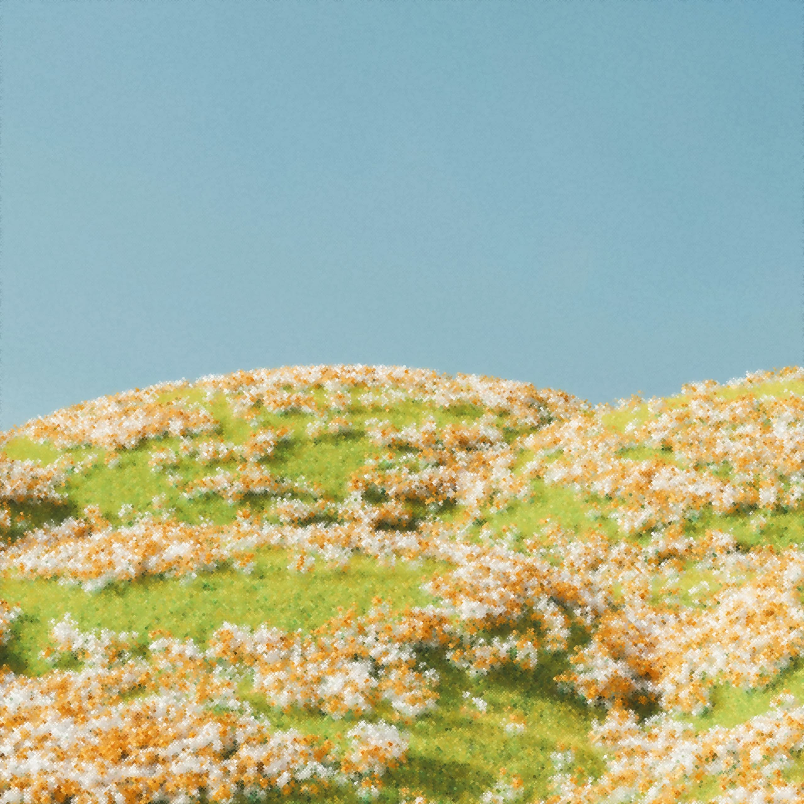
Nature
Modular, adaptable patterns and textures. Colours kept natural — no filter, no colour grade. Macro crops and negative space welcomed.
Nature imagery — asset incoming
Technology
Innovative, impactful tech in action — not glamour shots. Combine with human or nature elements for harmony and balance.
Technology imagery — asset incoming
AI-generated
Allowed for abstract, non-photo-realistic compositions. Use caution with photo-realistic AI assets — keep them natural and credible.
AI-generated imagery — asset incoming
In context
Brand in use
Examples of the system applied — covers, dark stat bands, marketing overlays.
Brand in use — hero cover (asset incoming)
Brand in use — dark stat band (asset incoming)